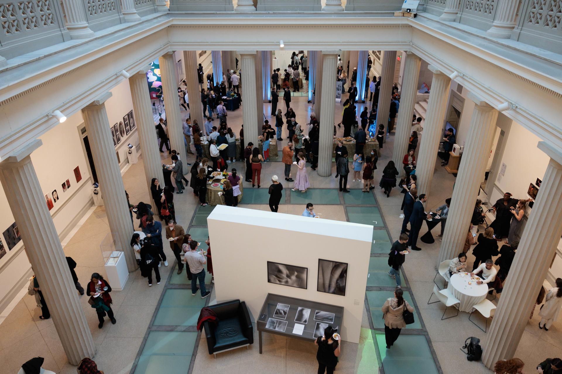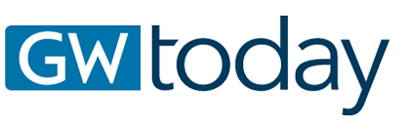
It’ll soon be clear to anyone passing the Corcoran School of the Arts and Design’s Flagg Building that something big is on its way. Story-height banners are going up on the building’s stately Beaux-Arts façade and the low display plinths known to students as “tombstones” to advertise NEXT 2022, the school’s culminating thesis and capstone show, which returns with an in-person opening night celebration April 28 after two years online.
The banners are vibrant and sophisticated: Occasional cutout photographs appear within abstract shapes and squiggles, evocative keyhole glimpses of the Flagg and its environs. The overall effect is playful, cohesive and extremely grown up. And no professional marketers or designers were involved. In fact, everything about NEXT 2022’s branding, from its font suite to its color scheme, is the vision of George Washington University juniors Amanda Bohn and Alexandra Tan.
The two graphic design majors are students in professor Cory Bernat’s Design Lab, a yearlong practicum that puts students in charge of creating a unified thematic drive for the school’s massive capstone exhibition. They’ll finish with a major GW event under their belts and a professional-quality portfolio before reaching their senior year.
(Left to right) Professor Cory Bernat and DesignLab students Alexandra Tan and Amanda Bohn pose in the Flagg Building space they'll help transform for NEXT 2022. (Amanda Bohn)
Bohn and Tan developed a visual identity loosely organized around the idea of nostalgia, as they write in their comprehensive brand guide: “The collective sense of loss and emotion that we have felt—both the time lost from the pandemic, as well as the bittersweet farewell to our senior classmates.”
It’s a theme Bohn remembered emerging “very early” in the brainstorming process as the two got to know each other and their professor.
“We were talking about the year that we had just had virtually, and now just jumping right back in,” Bohn said. “And that led into the NEXT branding—how can we make this about celebrating the seniors but also recognizing this collective emotional experience we all went through together?”
Both Bohn and Tan will experience NEXT in person for the first time this year, since the exhibition went fully digital in 2020 and 2021 due to the COVID-19 pandemic. As such, it was important to them that NEXT branding this year be site-specific—that it celebrate the Flagg Building’s particular physical space and the specificity of experiencing art in its intended site. (Visitors will be able to drop by NEXT during visiting hours from April 21 to May 15.)
Take the color scheme. Dominated by evergreen, celadon and muted teal, it also pops with yellow, raspberry red and cherry blossom pink, each named for a D.C.- or Corcoran-specific inspiration. Dark blue and jubilant gold pay homage to GW’s official colors.
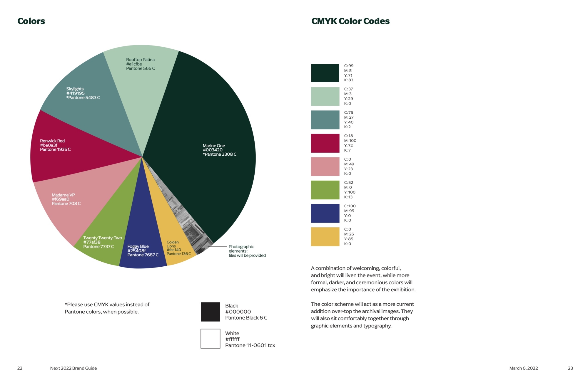
NEXT 2022 colors, named by Tan and Bohn. (NEXT 2022 Brand Guide)
“We took the blues from the patina on the building roof, and we really liked the idea of—since NEXT takes place in the spring—including these yellows and greens and cherry blossom pinks to add life back into it,” Tan said. “The darker blue is a fun accent because it’s based on these glass floor tiles in the Flagg Building. When you’re in the classrooms below, you can see the bottoms of people's feet. I remember freshman year that being like a very pivotal and cool and weird moment.”
Archival research was a major part of their brand development, manifesting especially in an element that is omnipresent but might be almost invisible to non-designers: the font suite. To settle on a typographic theme, Bohn and Tan pored through old exhibition flyers, architectural photographs and historic book plates. Their typography classes had taught them how to analyze a type’s details—its contrasts of width, its curves and angles and proportions—but they also wanted it to capture a vibe.
“We wanted something that had a somewhat modern look to it despite having a traditional, historical feel, and that came from so much archival research,” Bohn said. “With type, it was actually pretty easy to narrow down the list and go ‘This one’s a no, this is a yes.’”
The heart of the brand might be what Tan and Bohn call “the blobs”—“Sorry, the organic graphic elements,” Tan adds with a laugh. The fluid, amorphous shapes play over every part of the NEXT 2022 brand, complimenting the clean geometrical stateliness of the Flagg Building itself.
“We were dealing with a building that has such structure and seriousness and formality,” Tan said. “And we know NEXT is a formal event and a serious exhibition—but we also kind of knew that the building was going to speak on that for us. So why not have fun with it and do something really playful? A lot of our elements have an element of creativity and DIY, which I think makes it a lot more accessible for non-artists. You don’t have to be pretentious or know about art history to think the blobs are kind of cool.”
The blobs also have emotional resonance, Bohn and Tan said, representing the messiness and uncertainty of re-emerging in the aftermath of a global catastrophe.
“We were talking about the transfer from being in a virtual world to an in-person one when we came up with this idea of organic shapes,” Tan said. “They’re kind of about inviting in the messiness and the craziness of this world, things that aren’t so rigid and perfect.”
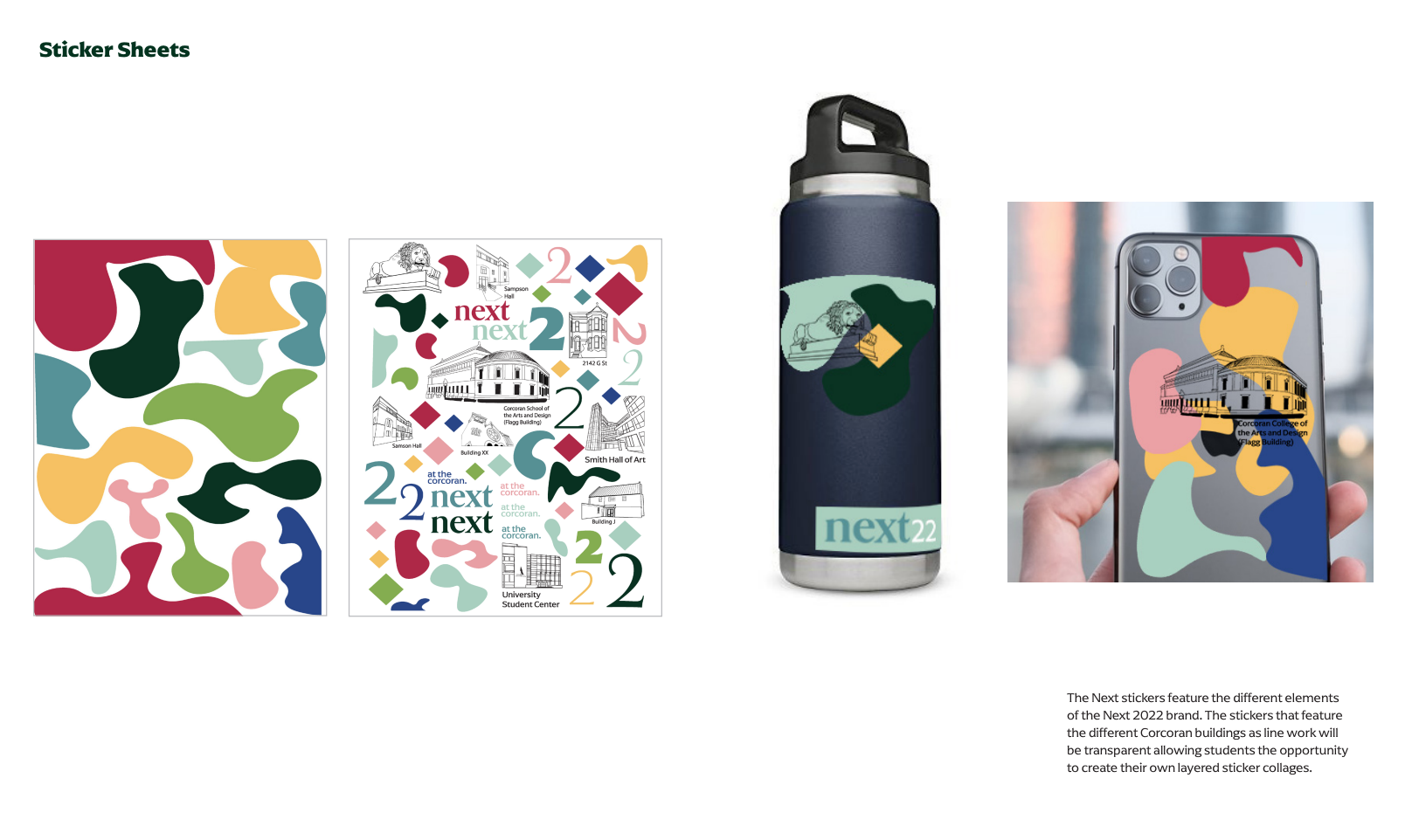
Stickers designed by Bohn and Tan demonstrate the versatility of "the blobs." (NEXT 2022 Brand Guide)
The brand development process could be messy, too, but Bohn and Tan say they lucked out in terms of their partnership. Bohn handled type and much of the technical formatting; Tan took the lead on colors and graphics. They worked together to produce deliverables, but their division of labor “just came naturally,” Bohn said.
“All the things I suck at, Amanda is incredible at,” Tan said. “And vice versa,” Bohn added.
Now, after two semesters of hard conceptual work, Bohn and Tan are handling the practicalities of producing a professional brand rollout: coordinating with printers and other vendors, managing projects and getting ready to see their work serve its intended purpose. In some ways, “it’s maybe the most satisfying part,” Tan said. “I’ve never had that kind of freedom to be able to go to vendors and be like ‘No, I don't want glossy paper,’ or ‘I want you to color match this.’”
As adult as those responsibilities are, she added, “It’s a little like being a child with a vision: We want it to be perfect.”
Visit NEXT 2022 from April 21 to May 15 at the Flagg Building, 500 17th St., NW. Hours vary daily; check go.gwu.edu/NEXThours for details. Visit NEXT virtually at next.corcoran.gwu.edu beginning April 21. RSVP for the Opening Night Celebration here.