
By Menachem Wecker
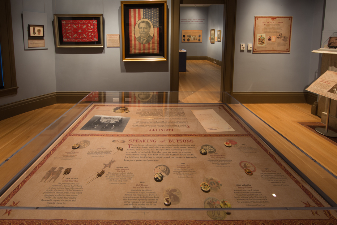
The dozens of objects in the exhibit “Your Next President…! The Campaign Art of Mark and Rosalind Shenkman,” which span from George Washington’s presidency to more recent election ephemera, are fascinating in their own right.
In one room, a glass case contains a parade helmet from Benjamin Harrison’s campaign and a two-pronged kerosene torch -- both from the 1880s. Across the room, a label depicts the overcoats marchers wore to protect their clothing from dripping kerosene. One hopes the fire department was on call, given the proximity of the torches to campaign banners.
In another room, an 1860 campaign banner for Abraham Lincoln and Hannibal Hamlin, printed on cotton and flax, has a misaligned print of the former and some repair stitching, not unlike the pattern on a baseball. The more than 150-year-old banner reminds visitors that many of the campaign objects weren’t intended to last several years, let alone centuries.
However fascinating each object is in isolation, the pieces -- which are on view at the George Washington University Museum and The Textile Museum until April 10, 2017 -- collectively point to even more important changes in how U.S. presidential campaigns operate.
Nowhere are those changes more prominent than in the layout of stars on campaign banners, which was essentially a wild west of graphic design until Congress passed the 1905 U.S. Trademark Act. That law forbade altering or marketing the American flag for commercial use. A 1912 law prescribed the arrangement of the stars as we know it today.
“Prior to that, there was no law saying that was how you do it,” said Jane Freundel Levey, M.A. ’91, a consulting curator at the Albert H. Small Washingtoniana Collection, which is also represented in the exhibit. “The placement was up to the artist.”
The Lincoln and Hamlin banner shows an inverted flag; the blue square, or canton, is in the top right, rather than left corner. A print of President Lincoln, based on a photograph taken by Mathew Brady, appears in a circle surrounded by two circles of white stars: 10 in the inner circle and 23 in the larger. There were, after all, 33 states at the time.
A 13-star William Henry Harrison campaign flag, from 1840, shows the blue canton in the upper right corner, where 12 small stars encircle one larger star. Written over the stripes is “Harrison and Reform,” and an illustration depicts the campaign’s leather ball for which he was famous. To “keep the ball rolling,” a label notes, the campaign wheeled a 10-football decorated with slogans to events.
The alignment of the 27 stars on an 1844 James K. Polk campaign parade flag is very telling. A portrait of President Polk appears opposite the inscription “Polk and Dallas,” and 22 of the white stars encircle him, while four others appear in the corners of the blue square. A 27th star, which is blue, appears on one of the flag’s white stripes: adjacent to, but distinct from, the others.
“Here’s the star waiting to be placed,” said Ms. Levey. The public, she said, would have understood the extra star alludes to Polk’s support of Texas statehood.
Much had clearly changed by 1900, when a pair of matching parade flags for rival tickets -- William McKinley and Theodore Roosevelt versus William Jennings Bryan and Adlai Stevenson -- displayed what looks like today’s flag design (albeit with 45 stars). The printer, however, added the faces of the four presidential and vice presidential hopefuls beside the flag layout: a sort of attempt to have its design cake and eat it too.
On a recent tour of the exhibition, Ms. Levey pointed out other noteworthy ways that political campaigns have changed over the years. Many of the posters were intended -- much like figurative stained glass windows and frescos in churches -- to communicate with less educated voters. “The American voter wasn’t necessarily the most literate,” Ms. Levey said.
Visitors to the show will also learn about Frances Folsom Cleveland. The first lady, Ms. Levey noted, was young and beautiful when her husband ran for the presidency. Without her permission, printers used her image to sell all sorts of products. “Newspaper reporters portrayed her as a paragon of Victorian womanhood and recorded virtually her every move,” a label states. “Much to the Clevelands’ annoyance, her image was appropriated for commercial advertisements.”
The label includes a depiction of an ad for “The Best Tonic,” a hair product, which featured a portrait of the first lady, as well as a promotion of a “superb painting of orchids” by Caroline Harrison, wife of Cleveland’s challenger, whose portrait evidently lacked the allure of Mrs. Cleveland’s.
But even as much has changed over the years, some things have remained the same. And where today’s presidential campaign seems unprecedentedly divisive, aggressive messaging has been par for the political course for a long time. “You do get the sense that there’s very little that’s new,” Ms. Levey said.