Readability and flexibility are key reasons for updating the university’s visual identity.
A refreshed logo and portrait of George Washington are the centerpieces of the university’s soon-to-be revealed visual identity, designed and created out of a need for elements that are more readable, flexible, bold and forward-looking.
“Although the current logo and portrait have strong design elements, they present some production issues,” said Leah Rosen, assistant vice president for marketing and creative services.
The logo, for one, is difficult to read at smaller sizes because of the “weight” of the font. Its thin lines disappear easily, especially on TV (image 1) and in digital applications. A key element of the current logo is also its rectangular shape. While suitable for the university logo, it created problems for departments and schools. Placed into a “force-justified” rectangle, long words became too condensed, short ones too spread out. In some cases, that put unintentional design emphasis on the wrong words, Ms. Rosen said.
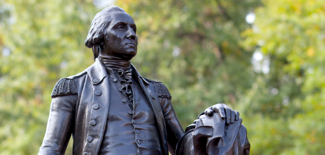
The current portrait of Washington isn’t ideal, either. It’s a photo of a portrait, rather than a digital creation. And it also shows Washington looking to the left, or the past, rather than right, toward the future (image 2). The new portrait, created digitally by John McGlasson, a double alumnus and a staff member in marketing and creative services, will give the university more flexibility. And it’s based on the most accurate likeness of Washington, the Houdon sculpture; a replica of it is in University Yard.
“While we were able to overcome some of these difficulties, the new visual identity is a logical next step for the university, especially in an increasingly digital world,” Ms. Rosen said.
The current logo and portrait were introduced in 2002, but at least four others have come before it (images 3-6).
Creating a New GW Logo and Portrait—Why Change Them?
August 22, 2012